Choosing One Word in Style
At the beginning of this year, I chose one word as a “fuzzy contextual beacon” for the year ahead. A word that might serve as a landmark and a guiding lighthouse as the year unfolded (it couldn’t have happened at a better time or in a more tumultuous year…). I chose this word with the guidance of the Choose One Word program by Dr. Jason Fox. Jason calls this process a “ritual of becoming”—it is indeed a powerful and magnificent spell. I recommend trying it yourself.
One of my favorite parts of the program (of many favorites), was the suggestion to create a way to embody your chosen word through “enclothed cognition,” meaning quite literally the way the clothes we wear change the way we think and experience our senses. The way we dress carries meaning and changes the way we think about ourselves more than we may assume. My word for the year is “diver,” so I put nautical flag pins on my backpack, and I got a new swimsuit and swimming goggles that put me in the mindset of a stylish deep sea diver.
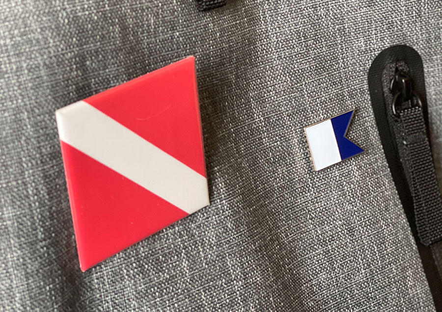 My backpack with diver pins—a thoughtful gift from Alex
As part of the ritual, I also created a /word page on this website, a metaphorical place to “herald” my word in the world and to revisit as the year went on. (Jason provided ample guidance for crafting this page as well.)
As I created the page, I wondered what it would mean to apply the idea of “enclothed cognition” to my /word page. What would it look like to design a page that embodied “diver” in its layout, colors, typeface, and navigation? And, what else could hold a sense of my word in addition to clothing? The physical clothes we wear are one layer of a full spectrum of embodied cognition that extends to include our online identities and the places we live in. Perhaps enclothed cognition could influence the clothes we wear in digital spaces—our social media profiles, personal websites, and online avatars in all varieties—as well as the the design patterns of the digital and physical spaces we live in every day—our homes, neighborhoods, towns, and online chat rooms.
So, I tried it out on the page by changing the colors, type, and layout so it was different than the design of the rest of my site, and I made a style guide so I might use the same styles later in the year for anything else I might design. Later in the year, I merged the /word page design into the design of the rest of the site, and I updated other personal profiles to match (such as my Twitter theme).
In a sense, the Choose One Word ritual is a way to create a generative pattern language for your self and for the potential of what might emerge in the year ahead. The word serves as a guiding beacon, but also as a seed, generating a whole from a single cell. The more we tend to a nuanced, carefully chosen word, the more it finds physical and metaphorical expression in our clothing, our relationships, our interests, and the places we shape. It’s the grammatical root of a language we can use to shape a wide range of our online and offline identities and places, imbuing each with the meaning and potentiality of a Word as a whole.
That sounds quite lofty and important (and it is), but in practice it’s rather mundane and a lot of fun. I’ve experienced the directional influence of my word in everything from shopping for clothes to rearranging my living room to creating a character in a video game. Without a word, these experiences might have a bit of a “blank page” syndrome—a starting point with no clear direction to start with. A word provides a starting directionality, a hint toward what you might embody as you shape whatever it is you’re creating. It also lends a feeling of lightness—it’s something to experiment with, and you’ll be choosing a new word for the next year, so whatever you choose now can just work for now with the knowledge you can explore another direction later. This results in design choices that have a distinct sense of character, perspective, and values that gives a sense of you.
How to make a visual style guide for your word
If you’d like to create a style guide for your word and aren’t sure how to start, here’s the approach I took.
Gather references
A visual design process often starts with inspirational images. I collected images of maritime British posters, Jacques Cousteau’s diving suits and diving vessels, old nautical maps, illustrations from 20,000 Leagues Under the Sea, and other nautical themed visuals. This starts as an intuitive process rather than a logical one—anything that pops into your head as loosely connected to your word is good reference to collect.
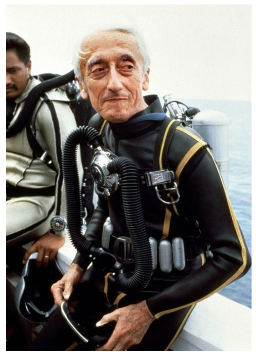 Jacques Cousteau in a diving suit
Choose one (or two) typefaces
Give choosing a typeface a bit of the same care and attention you’ve given to choosing a word. Jason describes choosing a word as similar to a fine wine or whiskey tasting—choosing a typeface is also similar.
There may be type in the inspiration images you’ve collected, in which case going to a site like Identifont might help you identify it, or more importantly the category and era of typeface. Typography has a long and rich history, so choosing a typeface with a historical context that fits your word is a boost to the power of the word. A good exercise is to browse font sample websites like Google Fonts and read about the history or the designer of the font.
I chose Clarendon because I saw slab serif fonts on British nautical-themed pub signs I had collected for reference.
Choose many colors
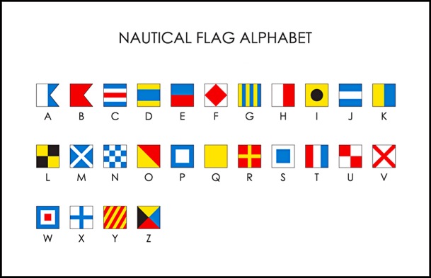
Your reference photos may include some colors that draw your eye as well. I was drawn to deep dark green diving suits with yellow accents and the colors on nautical flags. I like to choose a neutral grey-ish color for text, and then a range of other colors for accents, highlights, and other uses. My best recommendation is to follow this excellent guide from Refactoring UI to create a cohesive and flexible color palette by creating a grid of variations on each color. Be sure to give each color a mythic name. My colors include signal, seafoam, newsprint, coral, and treasure.
Of course there’s a lot more that goes into visual design than choosing colors and a typeface, but if you’re interested in making a style guide for your word, this will go a long way as a starting point. If you create a style guide for your word, I’d love to see it and the ways you’re enclothing your word (perhaps even a custom mechanical keyboard?)! Let me know about it on Twitter.
Published

Kevin McGillivray is a web developer, painter, and writer in Wisconsin. He writes about creativity, online and offline neighborhoods, and vegetables. He paints and dives.